INDUSTRY:
SPORTS & ENTERTAINMENT
CLIENT:
ANAHEIM DUCKS & HONDA CENTER
YEAR:
2021-2022
EXPERIENCE:
BRAND IDENTITY
Anaheim Ducks Branding
about.
Branding a beloved sports franchise is one of the most creatively charged challenges in the industry. The stakes are personal. Fans don't just follow a team, they grow up with one. And when that team was originally built by Disney and carries decades of cultural nostalgia, every creative decision carries weight that goes far beyond aesthetics.
During my time as part of the Anaheim Ducks in-house creative team, we were in the middle of one of the most meaningful brand evolutions in the franchise's history. The work wasn't just about making things look good. It was about honoring where the Ducks came from while proving they had arrived somewhere new.
challenge.
The tension between nostalgia and credibility was real, and it lived in every design decision we made. The Ducks had a fanbase that was deeply attached to the Disney era while simultaneously wanting to be taken seriously as a modern, competitive NHL franchise. We had to hold both truths at once.
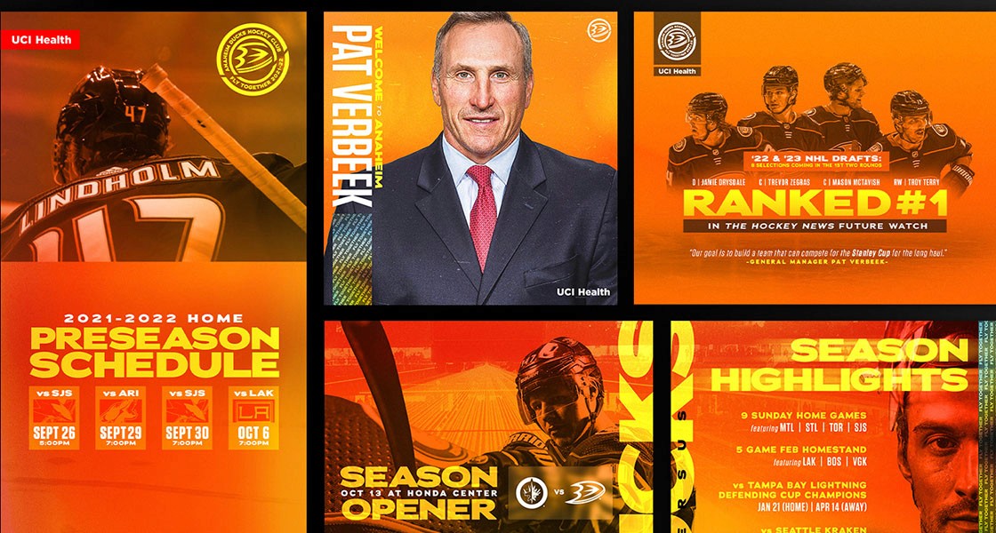
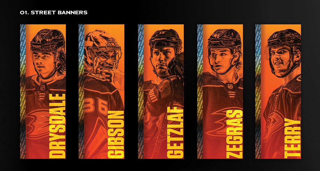
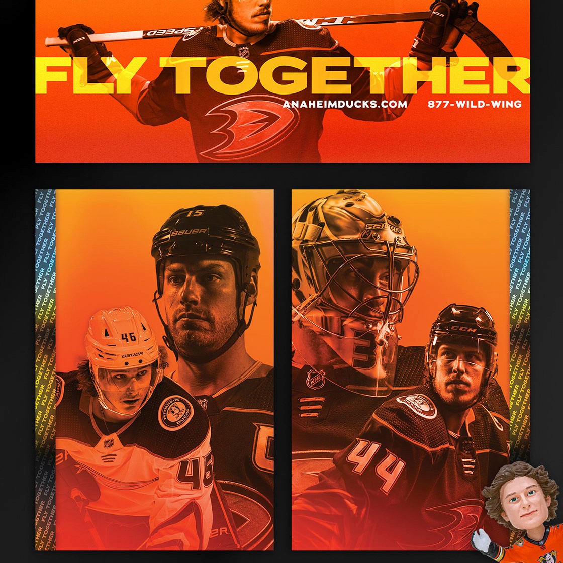
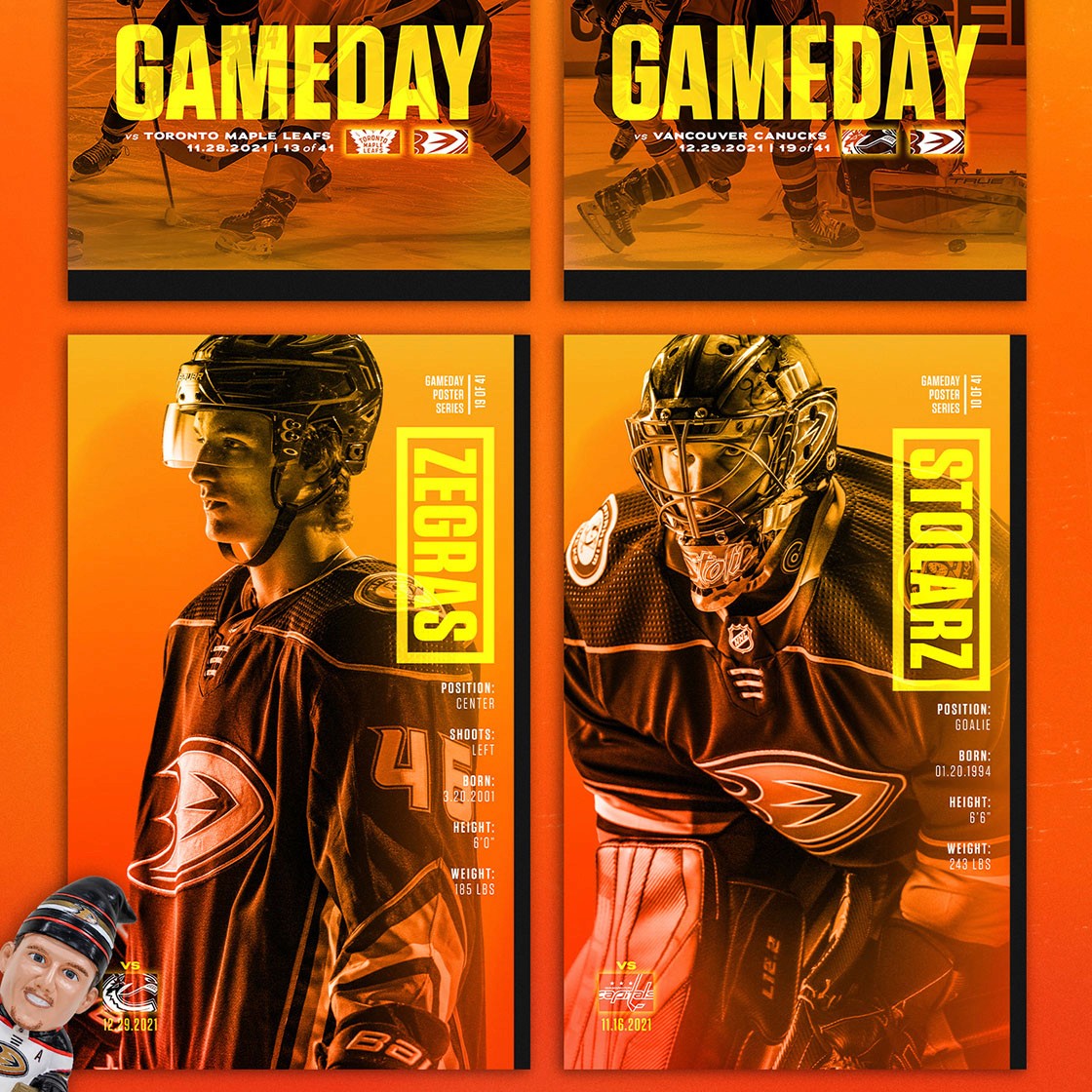
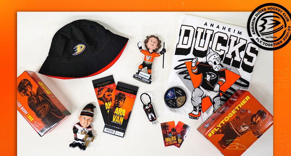
Our creative mission was to own orange. Orange County runs deep in the identity of this franchise, and we leaned into it with intention, building a visual language that felt bold, local, and undeniably Ducks across every format and every scale. Street banners, outdoor signage, gameday programs, social graphics, and merchandise all had to speak the same language consistently.
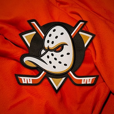
And then came the biggest creative decision of all: bringing back the iconic Mighty Ducks logo. That required real courage. It meant trusting that fans were ready, that nostalgia could be reframed as pride rather than regression, and that the new brand colors we had been building equity in could carry that beloved mark into a new era without losing the credibility we had worked so hard to establish.
result.
The brand landed. The orange stuck. And the return of the Mighty Ducks logo was met with exactly the kind of energy we had hoped for, fans who felt seen, respected, and excited about where the franchise was headed. The work we built during this era created a cohesive visual identity that spanned every touchpoint of the fan experience, from the arena to social media, and helped solidify the Ducks as a franchise with both a rich history and a bold future.
It remains some of the most complex, rewarding, and personally meaningful work of my career.